Continuing the Legacy…
CLIENT - PABST BREWING CO.
BRAND - PABST BLUE RIBBON - WHITE WHISKY
MARKET - USA
SCOPE - STRATEGY / PACKAGING DESIGN / PRODUCTION
BRIEF - CONTINUE THE PBR LEGACY OF QUALITY WHILST TRAVERSING CATEGORIES
The transition from iconic American beer to iconic American Whisky
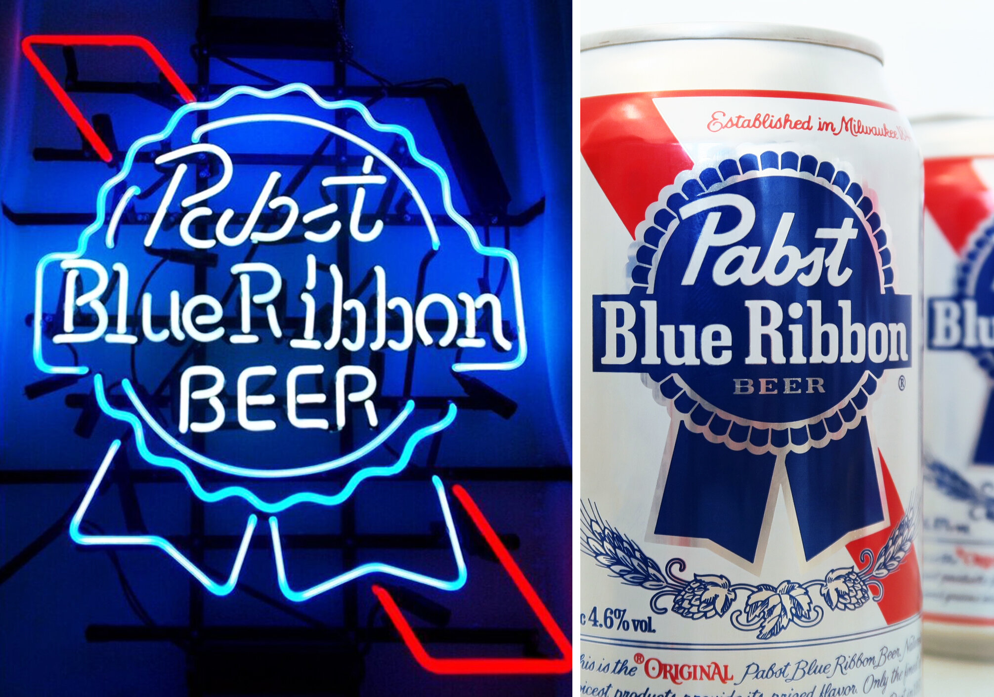


We were briefed by the US team to develop a white non-aged whisky for the iconic Pabst blue ribbon.In somewhat of a world first taking an infamous American beer and crafting it into an American whiskey. During creative development we dug deep into the brands history to identify those key brand assets that we would need to maintain To take over into the fledgling spirit. The blue award-winning rosette has been a long standing symbol of quality in the brands history. It was also important to maintain the integrity of the diagonal sash that runs behind it. fortunately the wax seal device is somewhat of a code in the American Whisky category...we were suitably dressed for our mission. We reinterpreted the rosette into more of a blue wax seal to connote Authenticity and quality. The diagonal line was screened onto the bottle and then follows through into the body label to keep the all important diagonal & rosette lock up. Distinctive fonts to the brand were also maintained to complete the crossover. We also decided that it would be important to print our unique mash Bill As proof of credentials in this space as well as a picture of Mr Frederick Pabst himself - the brands original founder & chief. The transition from iconic American beer to iconic American Whisky has been seamless. There’s never been a better way to enjoy Pabst Blue Ribbon...mines on the rocks