Organic Simplicity
CLIENT - JACOBS DOUWE EGBERTS
BRAND - ORG
MARKET - AUSTRALIA & NEW ZEALAND
SCOPE - DESIGN STRATEGY / VISUAL IDENTITY / PACKAGING
BRIEF - ORGANIC SIMPLICITY
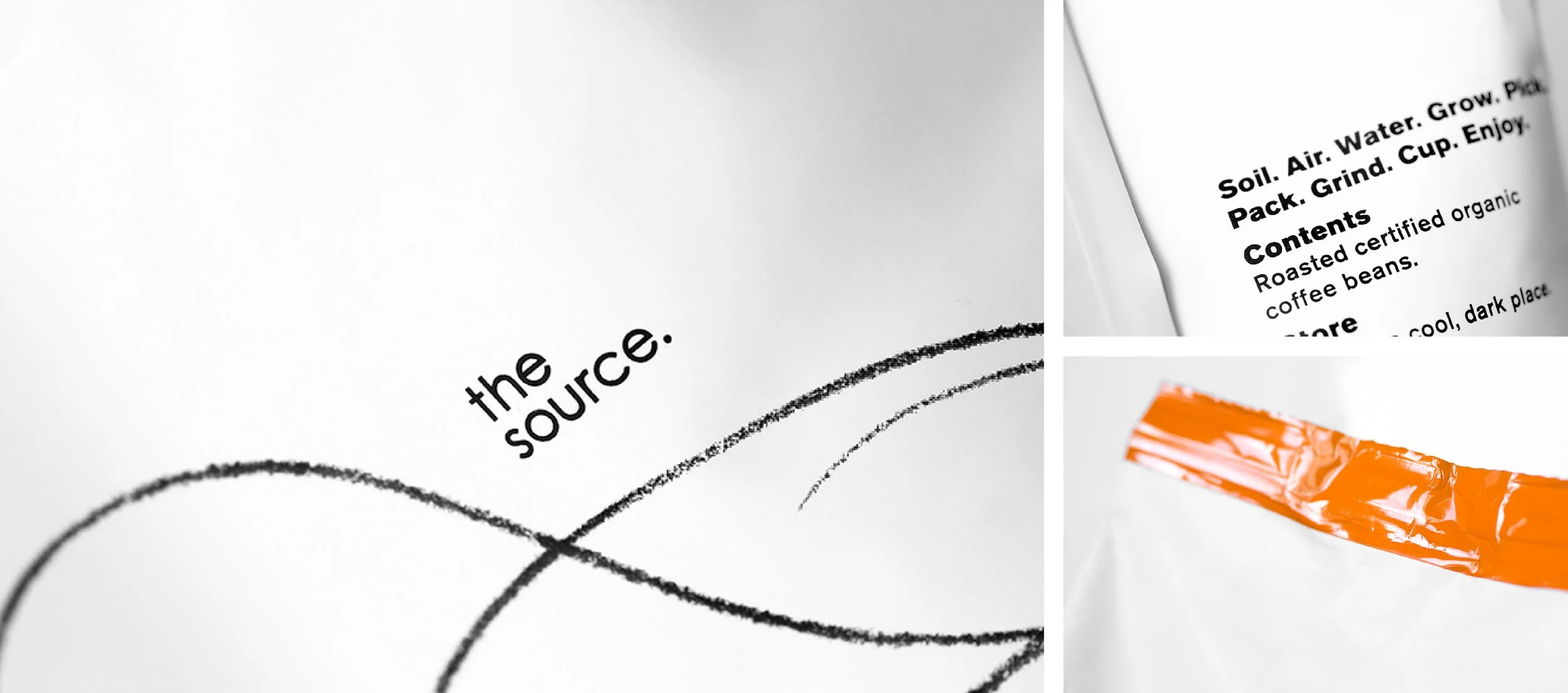
We created this new to world organic coffee brand for Jacobs Douwe Egberts to appeal to sophisticated café owners who have a shared mindset with the brands organic philosophy.
The aesthetic sought to distance itself from the world weary organic space of hessian sacks and natural palettes. Instead a Scandinavian / loft inspired look was employed to bring a high design sensibility to the brand, to support its premium positioning.
The design idea was ‘Organic Simplicity’. Within that decided to use a simple, beautiful organic hand drawn line that ebbs and flows its way around the identity, to elicit the mountainous terrains, synonymous with coffee growing regions. This line work was created by Sydney artist Debbie Mackinnon. White speaks to purity and simplicity, as does the elegance of the line. All this offset, with a small pop of vibrant orange to up the pace and add a twist of excitement to the serenity.